STARR EAST ASIAN LIBRARY
Location: New York, NY
Date of Completion: 2009
Program: University / Renovation
Size: 7,500 sq ft.
Client: Columbia University
Sustainability: Maximized reuse of existing historic interior and materials
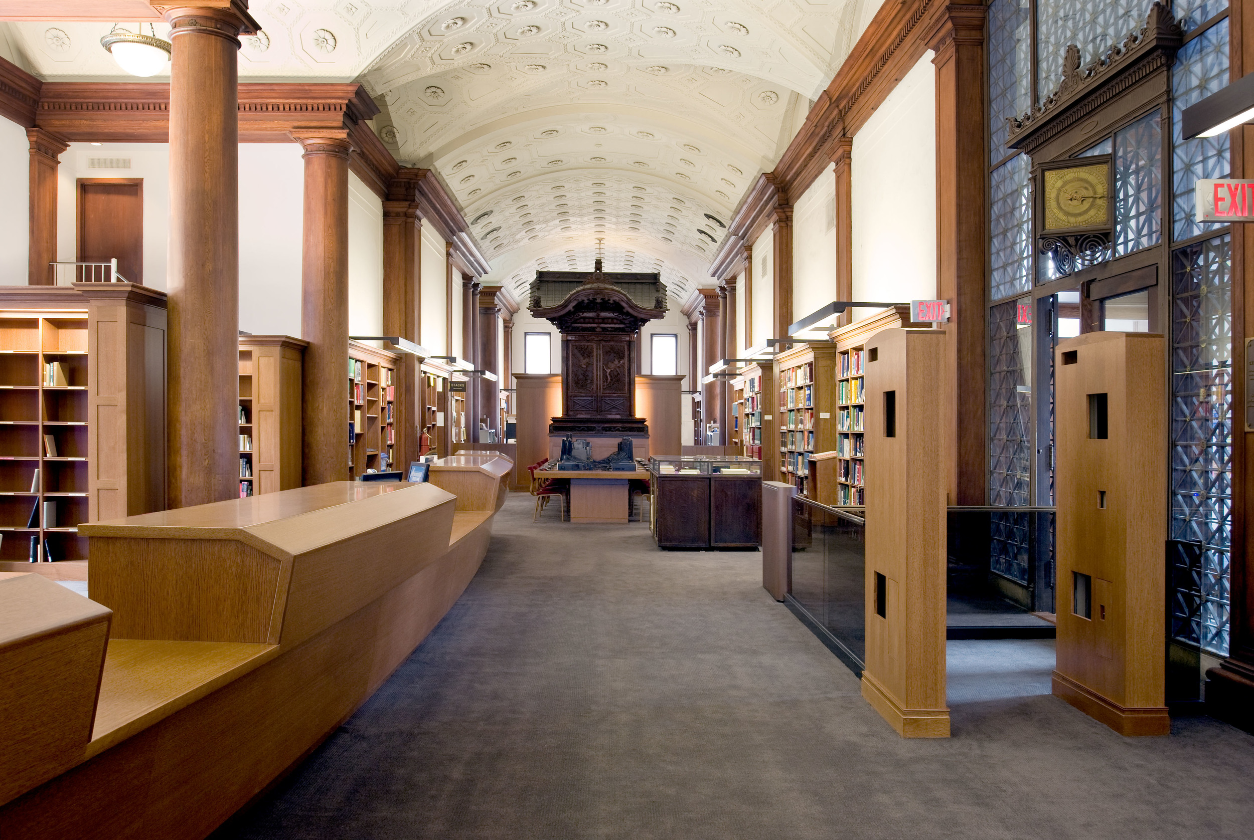
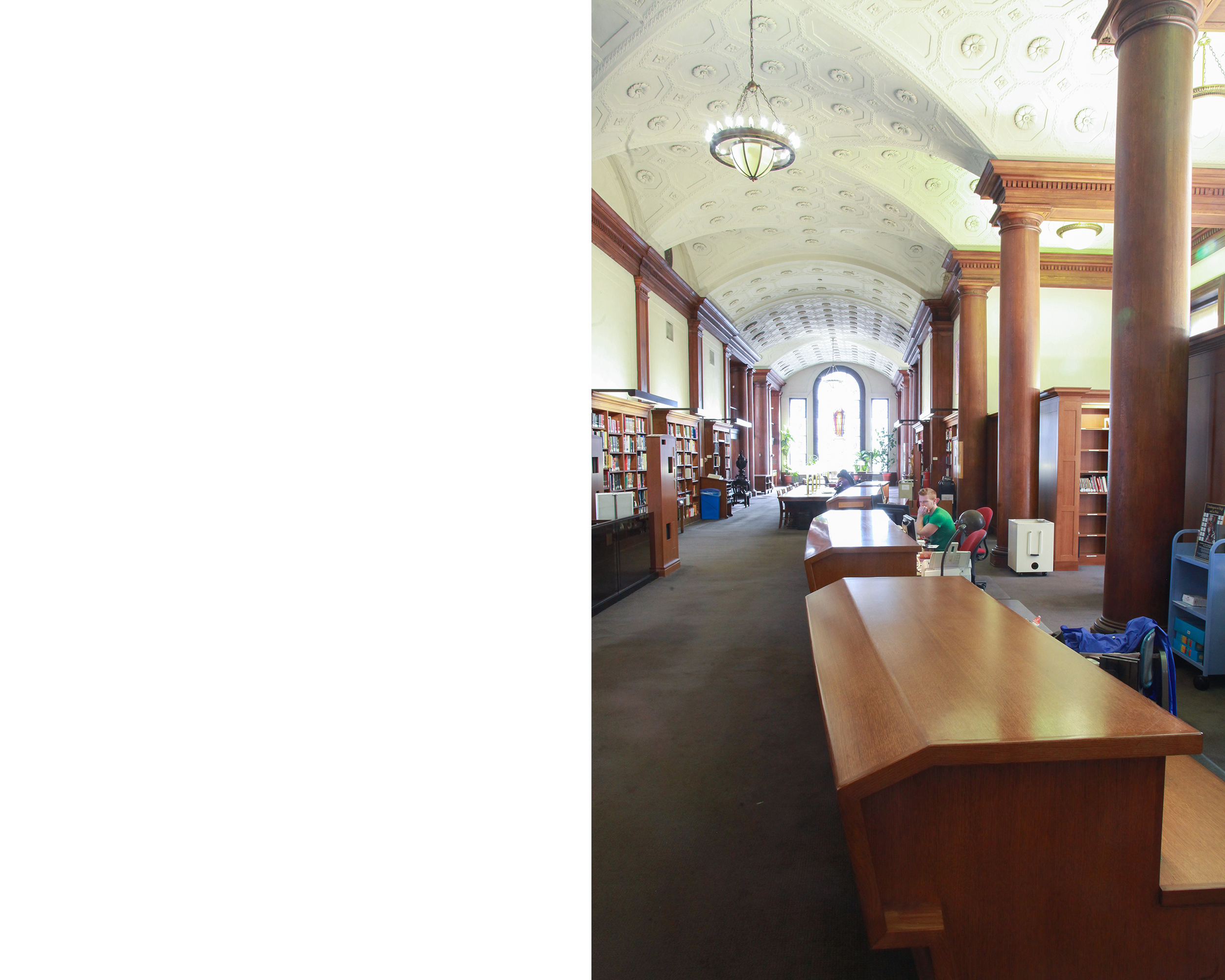
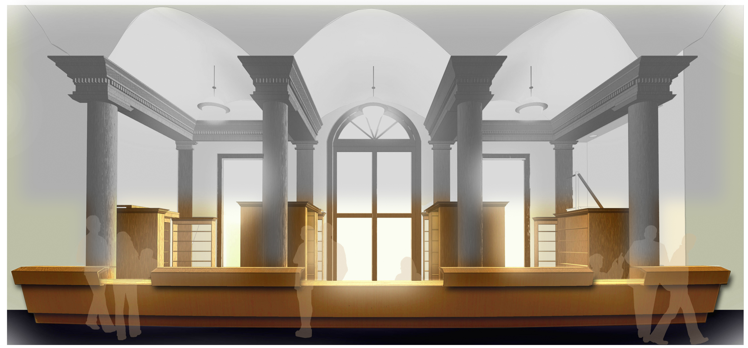
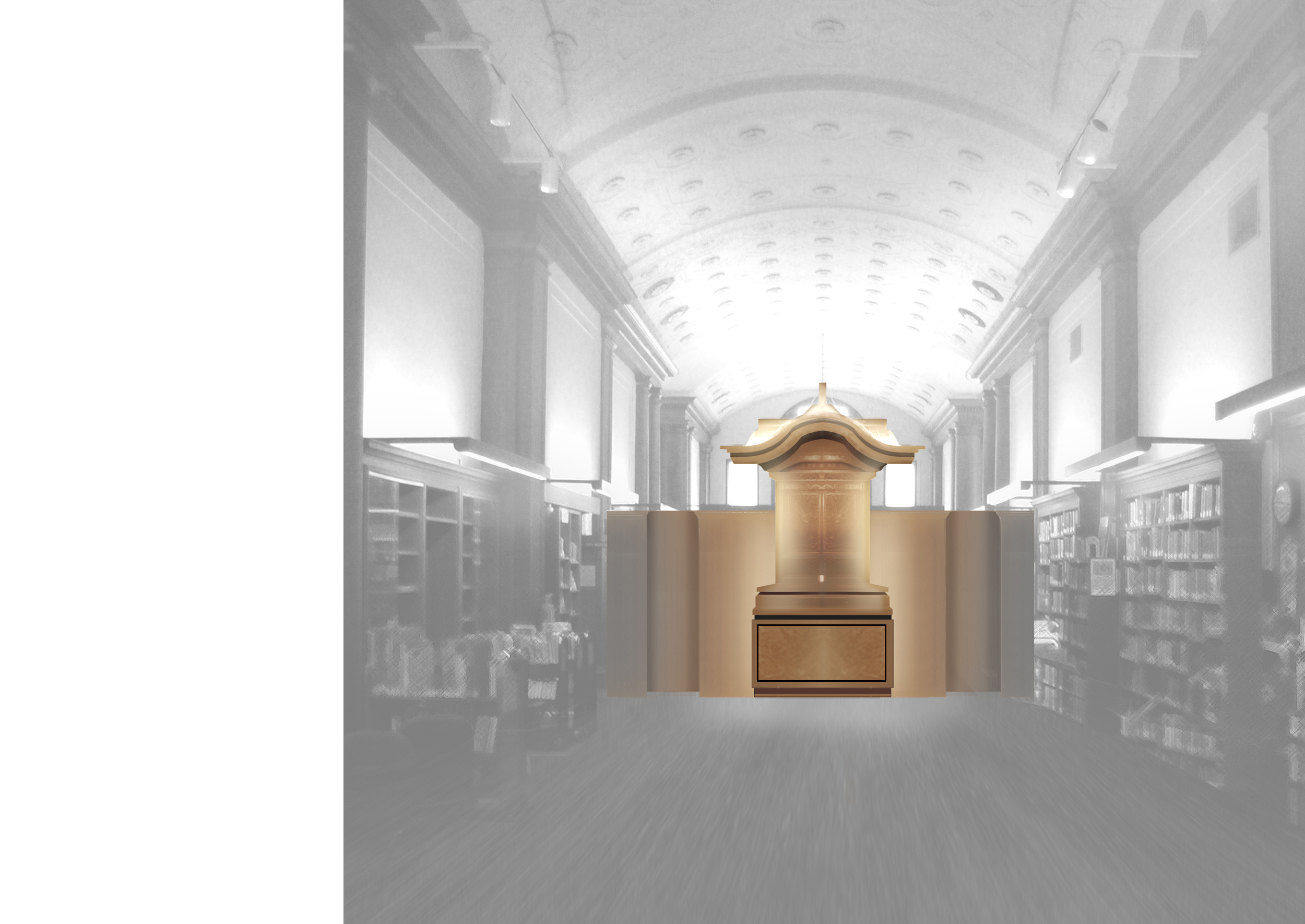
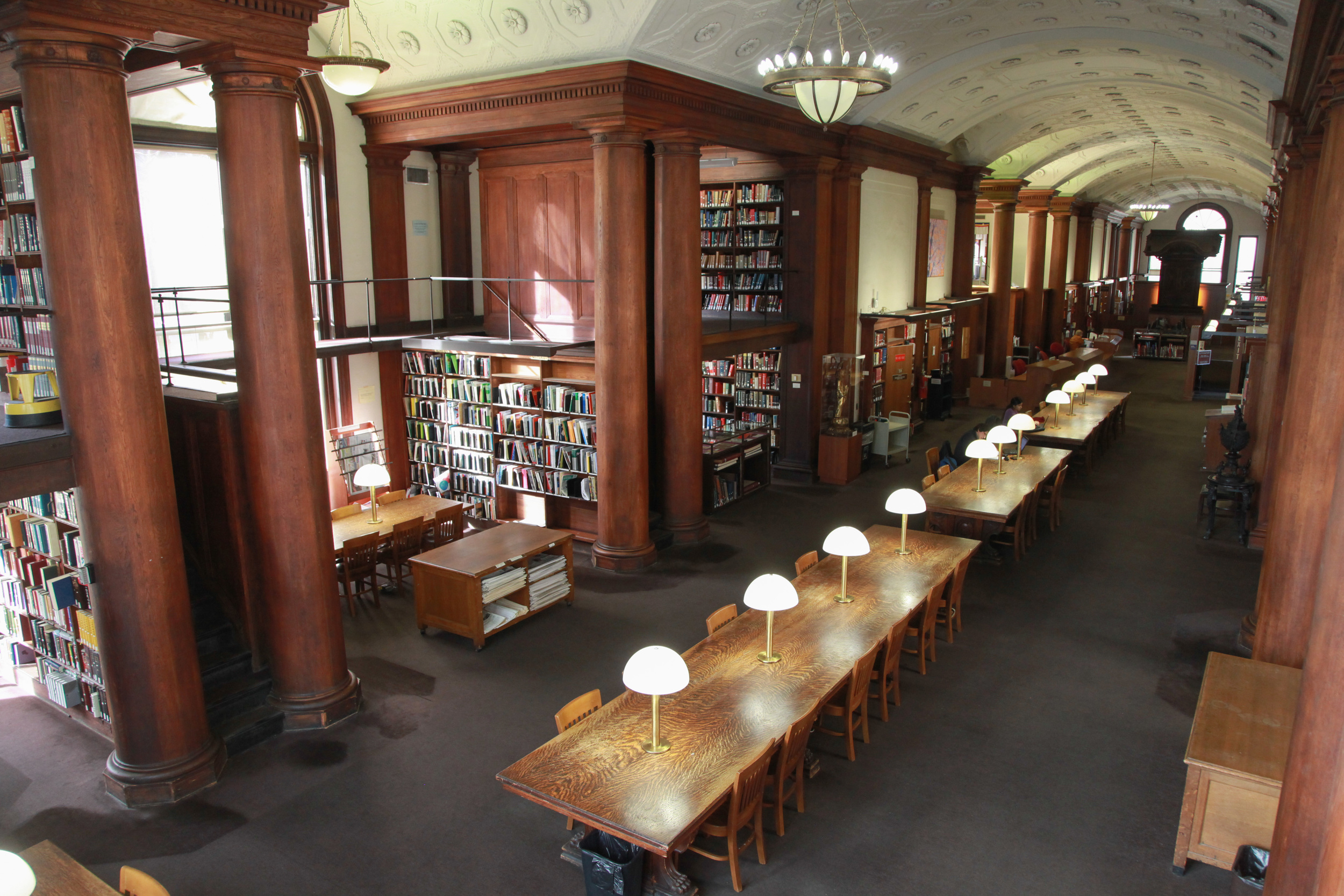
In the Starr East Asian Library at Columbia University, a subtle architectural gesture has added a new depth to the original Beaux Arts design by McKim, Mead, and White, lighting up the already beautiful with new vitality. The overall intervention intended to remove some incrustations from the Neo-Classical fabric and to give a new functional strength to the library, upgrading the information technology standards, revisiting the circulation and in doing so, creating a flexible public reading room. On top of the obvious electrical work, painting and carpet installation, it is interesting to observe how the new elements are placed in the heritage setting. A security enclosure was designed to have minimal visual impact. New bookshelves with a design that recalls those already existing occupy the areas between the elements that define the bays, forming a completion of the spatial order given by the existing rhythm of fenestration, columns and vaults. A Japanese woodcarving from the World’s Fair of 1900, the ‘Shrine’, has been located on top of a new plinth, placed centrally on the main axis, as if the space were firstly harmonised around it. The spatial organization that could have been perceived as an amazing frozen picture of a remote time, if left in this way, gets a new meaning with the introduction of the 42-foot-long circulation desk. Placed centrally on the entry cross-axis it clearly divides the functional areas of patrons and staff and works as an area of interaction between the two. Its shape is however what confers an added value to the library. The desk is almost the extrusion along a curve of a complex section that then gets cut by the light coming from the windows opposite to the entry. This cut has the practical reason of enabling accessibility for people on a wheelchair, but also grounds the piece of joinery into the space. The curve winds across few bays, compressing and enlarging the space and therefore introducing dynamism and a modern sensibility, which are necessary symbols for a leading educational institution.
– Simone Corda
Award:
2010 CWB Design Portfolio Award
Photographer(s): Blandon Belushin, Steven Yang


