QUEENS THEATRE IN THE PARK
Location: Queens, NY
Date of Completion: 2012
Program: Cultural Institution
Size: 20,000 sq ft.
Client: NYC DDC
Sustainability: Maximized reuse of existing space and materials
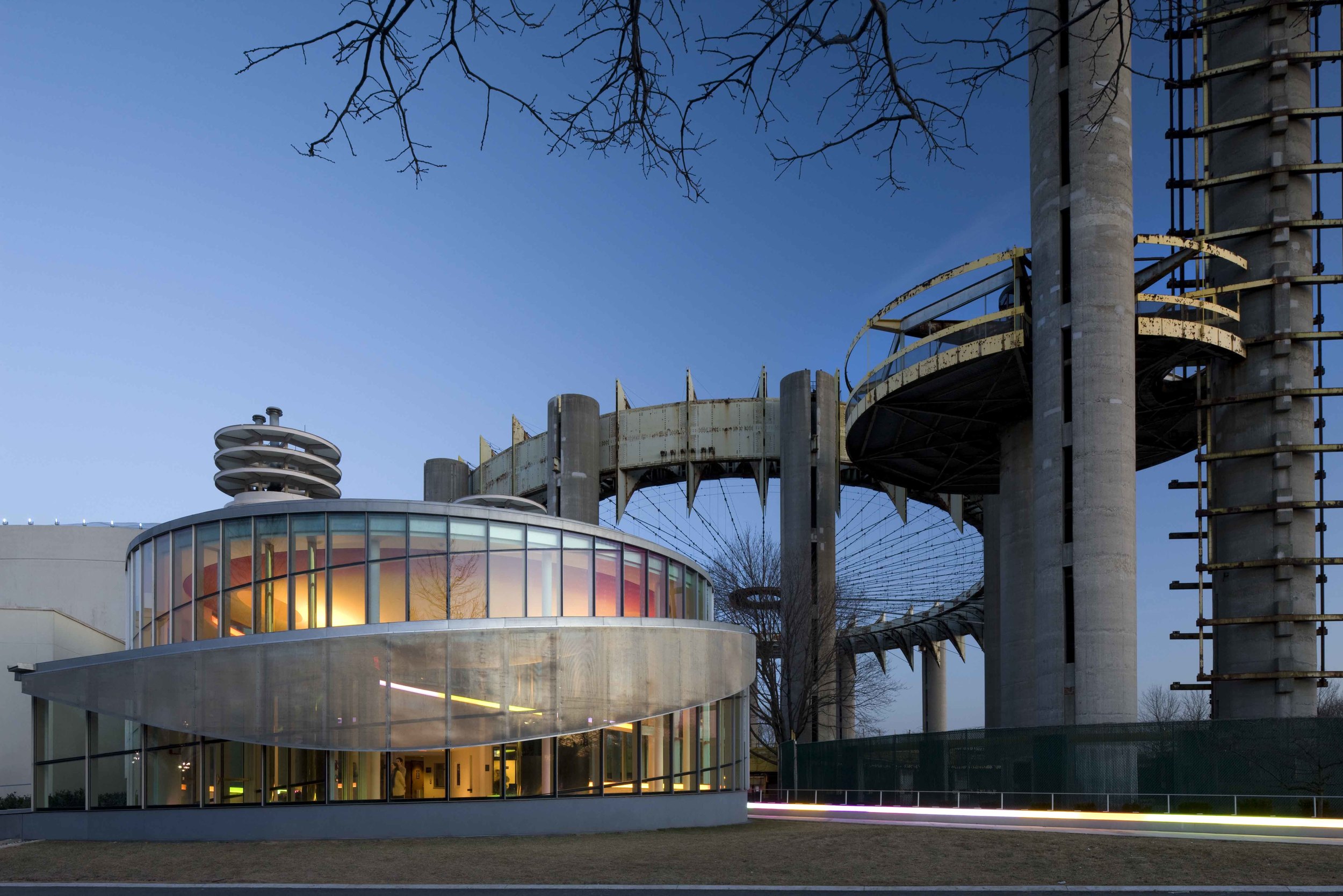
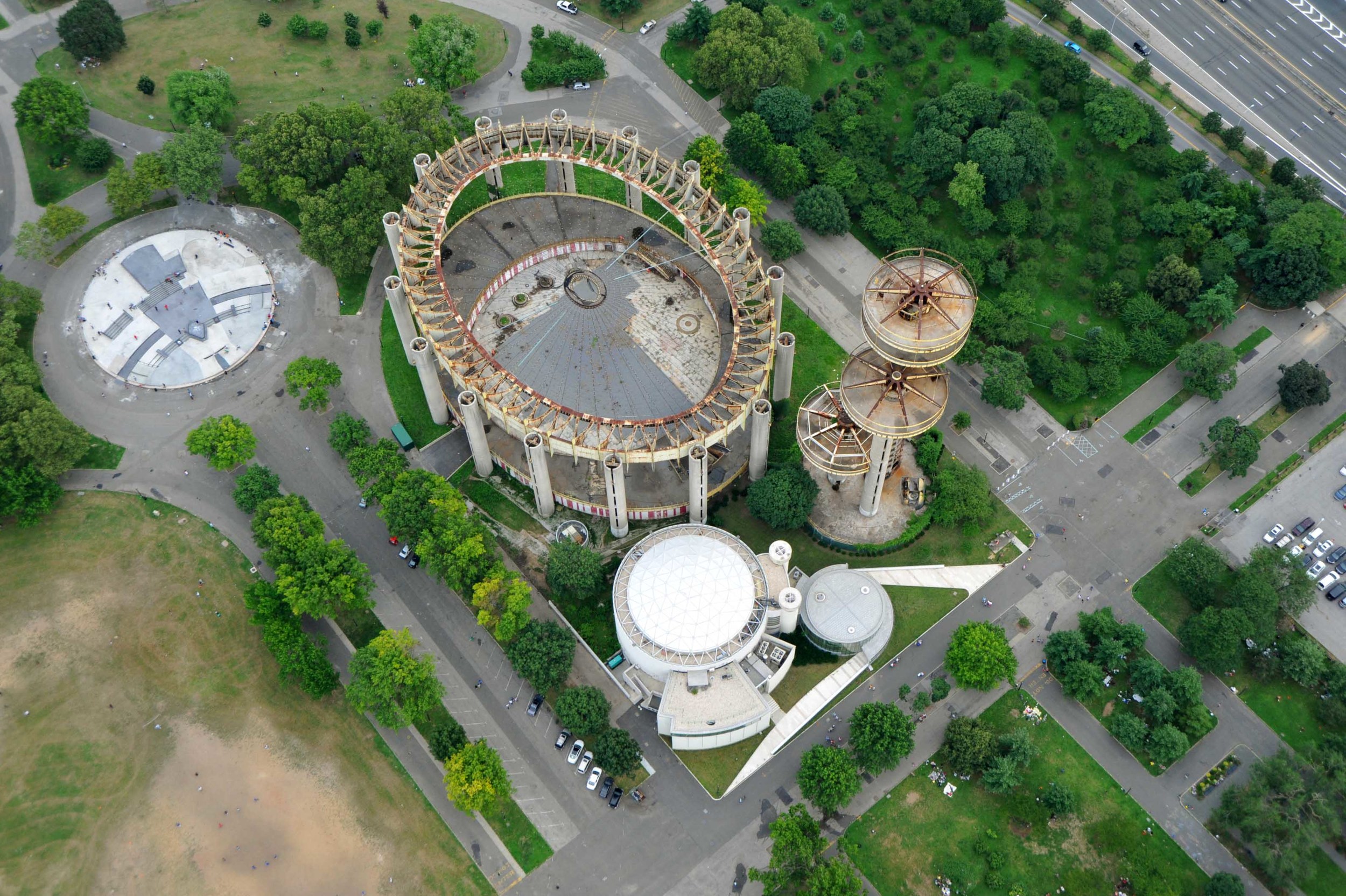
The 2011 Caples Jefferson Architects’ project for the Queens Theatre- in-the-Park reception room brings hope as the first bright step in the revitalisation of the area of around the World’s Fair complex. Built in 1964, the Fair awaits a clear renewal plan. The buildings originally designed by Philip Johnson and Richard Foster define an iconic dominance, a context that no other architecture can easily relate to both because of their shapes and history: a distant futuristic optimism solidified in circular-based structures. Nevertheless, from a superficial figurative analysis, the new 600-person reception room gives an impression of having always been a part of the complex. In fact, the architects created an assonance of building elements and shapes between the new and the existing structures: circular volumes, columns, and a tension-based roof are the most recognisable common features. It is however in the finer elements that the old and the new buildings reveal the dissimilar intellectual dispositions of the respective architects. The difference can be largely explained with an analysis of the long external ramps that continue into and within the building. These ramps generate complex spiralling forms that continue around the circular main volume, and climax in the domed ceiling. This is clear evidence of how the new building has been conceptualised according to the perception of a moving viewer rather than a static composition of volumes. To start off with, the external skin of the building has been designed to give the impression of a perfect curvature, despite its composition of large, flat, glazed units that its tight budget allowed. The design, using Gestalt principles, introduces metal fins projecting at each vertical joint in the glazed wall, drawing the viewer’s attention to focus on their vanishing around the curve rather than on the glass itself. Inside, the sloping roofs above the ramps continue into the main envelope, adding a dynamism to the movement generated by the
diagonal mullions. The superbly crafted elements thus coalesce not into the creation of an object, but into an experience, which begins in the surrounding landscape and culminates in a dazzling spatial triumph.
–Simone Corda
Awards:
2011
MASterworks Award for Best Restoration
Municipal Art Society
2011
A|L Design Award
Special Citation Best Use of Color
2010
Cultural Project of the Year
New York Construction 2008 First Prize Award for Excellence in Design Queens Chamber of Commerce
2008
Citation, National Awards for Excellence in Design National Organization of Minority Architects
Photographer(s): Nic Lehoux, Julian Olivas (aerial), Albert Vecerka/ESTO
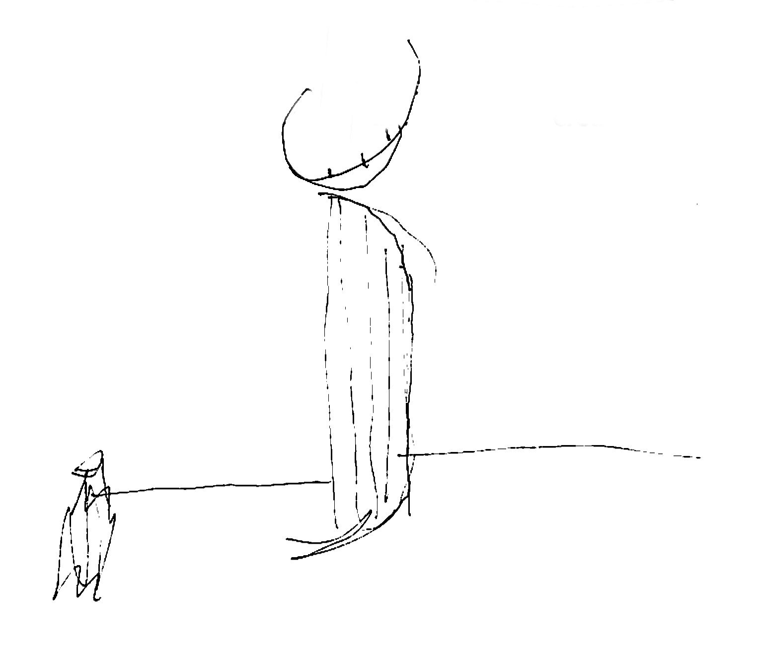
Building Form, Concept Sketch by Sara Caples
Gestalt of Curves, Concept Sketch by Everardo Jefferson
Aerial View of the Site
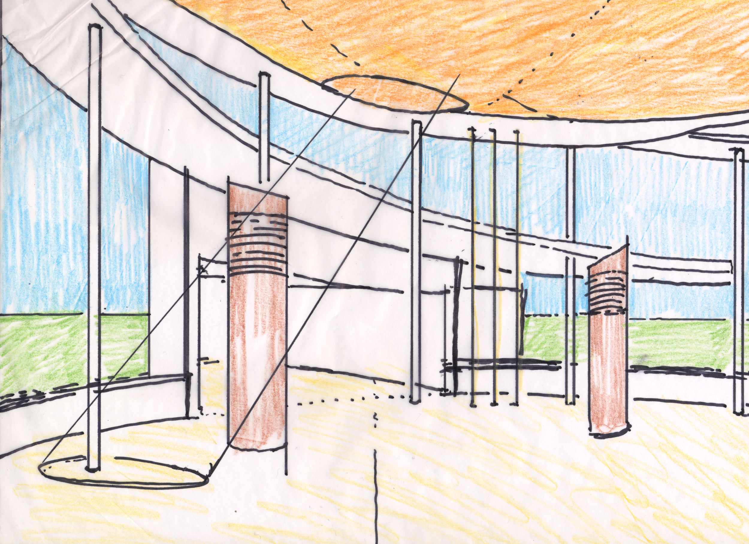
Interior View of Lobby with Nebula
Building Entryway with Johnson’s Forms in the Background
Building Seen Through Flushing Meadows Park
Sketch of Nebula by Everardo Jefferson
Interior View of Skylight and Air Tree
Building at Dusk
Theatre Interior
Windowsill Diagram by Everardo Jefferson
Windowsill Detail with World’s Fair Forms


